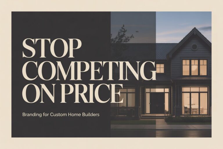
The Subtle Details That Make a Home Builder’s Brand Look Premium (and the Ones That Undermine It)

There's a specific moment in the brand review process at Breakpoint Studios where the conversation shifts. A builder is looking at two versions of their logo - same concept, different execution. One has slightly tight letter spacing and a font weight that's one step too heavy. The other has refined tracking, a slightly lighter weight, and a touch more whitespace around the mark. Most builders can see the difference. Almost none can articulate exactly why one looks more expensive than the other.
That gap - between seeing quality and understanding what's producing it - is where premium builder brands are won and lost.
In our experience working with 20+ Brisbane builders, the most common branding problem isn't a bad logo. It's a series of small decisions made without a framework, where each one seems reasonable in isolation but the cumulative effect is a brand that reads two or three price points below the calibre of the actual work. The builder is doing $600K homes, but the brand is communicating $250K homes.
This post breaks down the specific details that drive that gap - and what to do about them.
Typography: Why Some Builder Brands Look Like $50K Projects
Typography is the most underestimated element in builder branding. Most builders choose a font because it "looks professional" or "looks like it belongs in construction." The result is a sea of geometric sans-serifs and bold condensed typefaces that look interchangeable across the entire industry.
Font weight signals quality tier more than almost any other typographic choice. Heavy, condensed typefaces - think aggressive all-caps wordmarks with tight tracking - communicate volume, strength, trades. That's a legitimate brand signal for commercial construction or for a business competing on capability and output. But for residential builders targeting premium clients, that same typeface signals the opposite of what's needed. It says: high throughput, standardised product. Premium residential clients are not buying a standardised product.
Premium builder typography tends toward the following characteristics:
- Moderate to light weight in the primary typeface - enough structure to feel grounded, not so heavy it feels industrial
- Generous tracking (letter spacing) in headings - compressed tracking looks cheap; spaced-out tracking looks considered
- A secondary serif or editorial typeface for body copy - this is what separates brands that feel curated from those that feel generic
- Intentional hierarchy - a clear visual difference in size and weight between H1, H2, body, and caption
The luxury brand creation process always includes a full typography system - not just a primary font, but a hierarchy that works across the website, proposals, and printed materials. When typography is treated as a system, the brand looks cohesive everywhere it appears. When it's chosen as an afterthought, it undercuts everything else.
Colour Psychology in Builder Branding: What Your Palette Is Communicating
Colour is where a lot of builder brands make their most expensive mistake - and where a single right decision can shift the entire positioning of the business.
The most common colour choice in builder branding is some variation on navy, white, and either a warm grey or gold accent. This isn't wrong - it's just crowded. Every second residential builder in Brisbane is using the same palette, which means standing out requires either a dramatically different palette or executing the common one with enough precision that the quality of execution does the differentiation work.
Here's what specific colour choices communicate in the construction market:
- Dark earth tones (charcoal, deep olive, warm brown): Signals craftsmanship, materials, permanence. Works well for builders who want to communicate quality of finish and attention to materials. Resvita's branding uses this palette to convey a warm, considered quality of build.
- Stark white and black with a single accent: Signals premium, architectural, design-led. Works best for builders producing architect-designed homes or heavily design-influenced residential work. Communicates aspiration and restraint.
- Navy and gold: The legacy builder combination. Communicates reliability, longevity, trust. Lower differentiation now due to saturation, but remains effective if executed with strong typography and photography.
- Light neutrals with a muted accent: Increasingly common in premium residential. Signals calm, elevated, considered. Particularly effective for builders targeting renovations or custom builds in established Brisbane suburbs (Paddington, Ascot, New Farm).
Why Consistency Matters More Than the Colours You Choose
What undermines a colour palette isn't usually the colours themselves - it's inconsistency. A carefully chosen palette applied inconsistently across the website, business cards, site signage, and proposals looks worse than a basic palette applied consistently. The brand detail that most often slips is the exact hex code for digital applications vs the CMYK equivalent for print. When these drift, the brand looks slightly off across different touchpoints - and prospective clients notice, even if they can't explain what they're seeing.
Logo Mark vs Wordmark: What Actually Works for Residential Builders
This is one of the most practical decisions in the brand creation process, and one of the most commonly misunderstood.
A wordmark is the business name in a designed typeface, with no separate graphic element. A logo mark is a symbol or graphic icon that accompanies or stands independently from the name. A combined mark uses both together.
For residential home builders, here's the honest assessment based on what we see working in the Brisbane market:
Wordmarks work exceptionally well for smaller, boutique residential builders - particularly those where the founder's name is part of the business identity, or where the business is building a personal brand as much as a business brand. A well-executed wordmark communicates confidence; it says the name is strong enough to stand alone. Classik Construction's brand identity leans into this - the name carries the positioning, and the typographic execution reinforces it.
Combined marks work best for builders scaling beyond the founder - where the business needs an identity that can stand independently of any individual. A strong mark also gives the brand flexibility: it can be used on its own on site signage, embroidery, or social media profiles where the full name doesn't fit cleanly.
What to Avoid in Builder Logo Design
What tends not to work: a house-shape icon, a rooftop silhouette, a set of geometric lines meant to suggest a floor plan, or a hard hat incorporated into a wordmark. These are category clichés. They might communicate "builder" immediately, but they communicate nothing else - they don't signal quality tier, positioning, or differentiation. In a competitive market, looking immediately like a builder while looking identical to every other builder is a positioning failure.
The right answer depends on where the business is going, not just where it is. A brand system built with the residential builder package considers the 3–5 year horizon: what will the business look like at twice its current size, and does this mark still work then?
The Details That Appear in Tenders and Proposals
This is the detail that almost no one considers during a brand project - and the one that matters most when the real money is on the table.
A prospective client is sitting with three builder proposals. All three are for comparable scopes. The prices are within 10% of each other. What determines who wins?
In most cases, it's confidence. And confidence comes from brand coherence. A proposal from a builder with a polished PDF template, consistent typography, a professional header with their logo and contact details, and clear section hierarchy looks fundamentally different from a Word document with a logo pasted in the header.
The Touchpoints Most Builders Overlook
The brand details that extend beyond the website are:
- Proposal and quote templates - the same colour palette, typography, and layout system as the website and brand assets
- Email signature - the logo, correct contact details, a clean layout that doesn't look like the default Outlook grey box
- Site signage - the logo mark and brand colours applied at the right proportions, not stretched or pixelated
- Document footers - a consistent brand detail that most builders skip entirely
- Social media profiles - the profile image, cover photo, and post templates all consistent with the primary brand system
None of these elements win the work on their own. But they form a cumulative impression. A builder who shows up consistently - same mark, same palette, same quality of presentation - across every single touchpoint has a brand that does sales work passively. Every time a prospective client interacts with the business, before any conversation happens, they're receiving the same signal about quality.
The branding for home builders work we do always includes guidelines that cover these applications - not just what the logo looks like, but how it behaves across real-world use cases. A brand without implementation guidance is a brand that drifts over time.
What Does Premium Builder Branding Actually Cost to Do Properly?
It's worth being direct on this, because a lot of Brisbane builders have been burned by either overpaying for something generic or underpaying for something they outgrow in eighteen months.
A proper brand system for a residential builder - one that includes strategy, positioning, logo and identity design, typography system, colour system, and brand guidelines - typically takes 3–4 weeks from brief to delivery. According to HIA data on residential construction business investment, builders who invest in brand and digital presence at a strategic level see measurable improvement in enquiry quality within the first business quarter after launch.
The investment level should match the size and ambition of the business. A sole-trader builder doing 3–4 homes per year has different needs than a builder doing 15+ homes annually with a team. What shouldn't change is the intentionality - a brand built on clear positioning decisions, executed with typographic precision, and applied consistently across all touchpoints performs well at any size.
Brand Detail Audit - 6 Things to Check on Your Builder Brand
Run through these six checkpoints on your current brand:
- Typography: Does your primary font communicate the quality tier of your work? Is it being used consistently (correct weights, correct sizes) across digital and print?
- Colour consistency: Are you using the exact same hex and CMYK values across all touchpoints - website, proposals, signage, social media? Are they visually consistent across screen and print?
- Logo application: Is your logo always used in the correct proportions? Does it work at small sizes (email signature, social profile)? Is there a minimum size below which you don't use the full-colour version?
- Proposal and document templates: Do your proposals look like they came from the same business as your website? Are fonts, colours, and layout consistent?
- Photography style: Is there a consistent style across your portfolio - lighting, framing, time of day? Or does each project look like it was shot by a different photographer with a different brief?
- Brand mark differentiation: Does your logo mark communicate something distinctive about your business, or does it look like a generic builder logo? Could a prospective client tell yours from a competitor's if the name was removed?
Most builders will identify at least two or three checkpoints where the details have drifted. That drift is costing you positioning every time a prospective client encounters your brand.
Frequently Asked Questions
What makes a home builder's brand look premium vs budget?
The difference between a premium and budget builder brand is almost entirely in the details of execution rather than the underlying concept. A builder can have an excellent logo concept that reads as budget due to poor typographic choices - font weight that's too heavy, tracking that's too tight, or a secondary typeface that clashes. Similarly, a strong colour palette undermined by inconsistent application across touchpoints creates a fragmented impression that prospective clients read as unprofessional, even if they can't articulate why.
Premium builder brands share a few consistent characteristics: restrained typography with intentional hierarchy; a colour system with specific values applied consistently across every application; professional photography that accurately represents the calibre of work; and consistency across all touchpoints, including proposals, email signatures, and site signage. The cumulative effect of these details is a brand that communicates the same quality signal at every interaction - and for a residential builder, where the sale cycle involves multiple interactions before any commitment is made, that consistency builds genuine confidence in the business.
How often should a home builder update their brand?
A home builder brand typically needs a meaningful review every four to six years, though the trigger should be a business milestone rather than a calendar date. The most common signals that a brand needs updating include: the business has moved upmarket and the brand no longer reflects the calibre of current work; the logo or typography looks visually dated compared to competitors and newer industry entrants; the business has changed structure (taken on partners, rebranded as a company) and the identity needs to reflect that; or the brand is visually inconsistent across touchpoints because it's been informally modified over time without guidelines to govern it.
A brand refresh doesn't necessarily mean starting from scratch. In many cases, the underlying concept is sound but the execution needs tightening - updating typography, refining the colour system, standardising all applications, and producing proper guidelines. This is often a faster and more cost-effective process than a full rebrand. The important test is whether the current brand accurately represents where the business is going, not just where it has been. A brand built for a builder doing $200K projects will not serve the same business well when it's targeting $700K projects.
What should be included in a builder's brand guidelines?
Builder brand guidelines should cover every situation in which the brand will be applied, with enough specificity that anyone can implement the brand consistently without making judgement calls. At minimum, this includes: the primary logo and all approved variations (reversed, single colour, minimum size); exact colour values in RGB, CMYK, HEX, and Pantone where applicable; the full typography system including font names, weights, sizes, and line height rules for each heading level and body copy; clear rules for spacing and clear space around the logo mark; and real-world examples of correct and incorrect usage.
For residential builders, guidelines should extend to the specific applications that are most commonly used: proposal and quote document templates, email signature specifications, social media profile and post templates, site signage proportions and colour application, and vehicle or workwear branding rules where relevant. Guidelines that only cover the logo itself leave too much to interpretation. The value of thorough guidelines is that the brand stays consistent as the business grows, new team members join, and more agencies or suppliers touch the brand materials over time.
Conclusion
The details in your builder brand are doing constant, silent work - in every proposal you submit, every site sign prospective clients drive past, every Instagram post, and every email you send. When those details are right, the cumulative effect is a brand that pre-qualifies the right clients before they've spoken to you. When they're inconsistent or wrong, the cumulative effect is a brand that makes prospective clients uncertain - and uncertain clients default to comparing price.
The encouraging reality is that most of these details are fixable. Typography, colour consistency, proposal templates, photography style - these are all controlled variables. What they require is intention: deciding what you want the brand to communicate, then ensuring every detail is aligned with that decision.
If you want to see what your builder brand looks like through that lens, book a free brand preview →
About Devlin Hampson
Devlin Hampson is the founder of Breakpoint Studios, a Brisbane digital design agency specialising in web design and branding for residential home builders. He works with builders across Queensland to help them attract premium clients and reduce low-margin enquiries. With experience across 20+ builder brands, Devlin focuses on the intersection of brand credibility and conversion - building digital systems that attract higher-budget projects and pre-qualify enquiries before the first call.
Connect on LinkedIn: https://www.linkedin.com/in/devlinhampson/
You May Like