Web Design for Home Builders: What Actually Converts in Brisbane
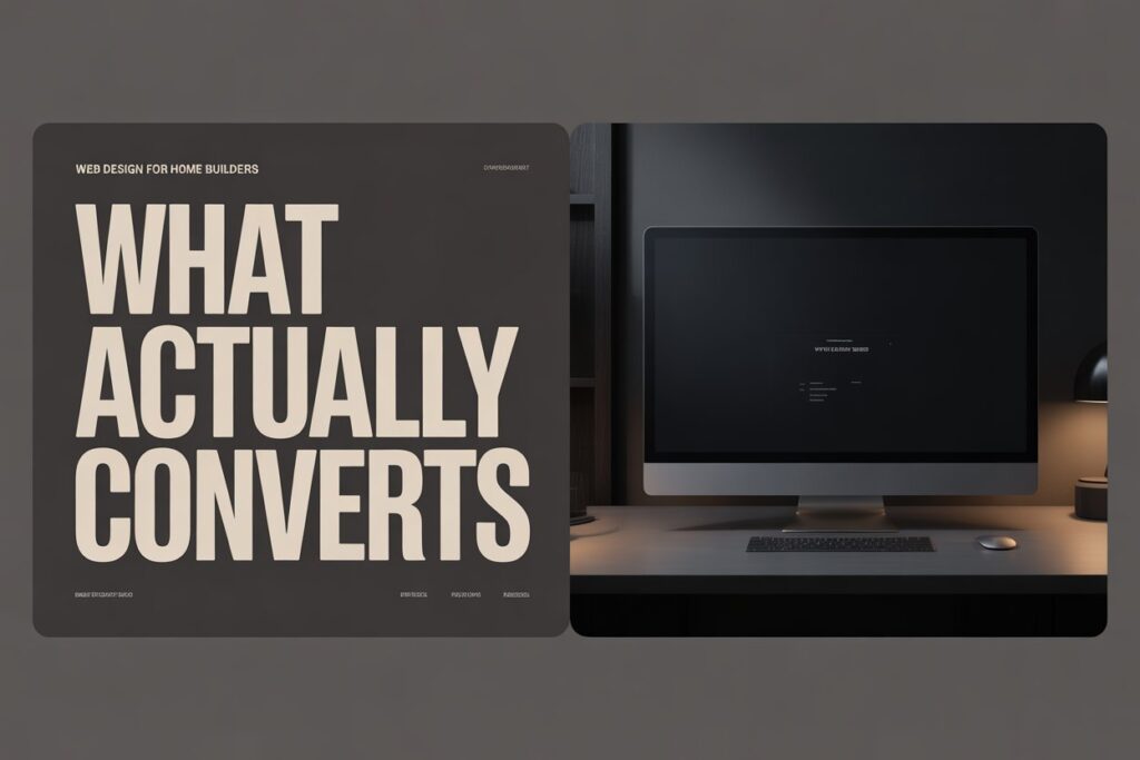
Most home builder websites look good. They have professional photography, a clean layout, a portfolio page, and a contact form. And they don’t convert. The reason is almost always the same: the site was designed to impress, not to generate enquiries. There’s a real difference between a website that makes a builder proud when they show it to a mate and a website that turns a cold visitor into a qualified lead. After working with 20+ Brisbane builders on web design for home builders, the gap between those two things is well documented. This post covers what actually drives enquiries from premium residential clients – not generic web design theory, but the specific elements that work for builders in Brisbane. Why Generic Web Design Doesn’t Work for Home Builders A home builder’s website has a completely different job to most business websites. You’re not selling a $50 product or a monthly software subscription. You’re asking someone to trust you with a $500,000 or $800,000 decision – often the largest financial commitment of their life. That changes everything about how the website needs to work. Trust Has to Come Before the Conversation In most industries, a website can get away with being a digital brochure. The sale happens in the meeting. For builders, the meeting only happens if the website passes a trust threshold first. Prospective clients are screening you before they ever pick up the phone – and they’re doing it by reading signals you may not even know you’re sending. A generic template, stock photography, or thin page content signals that the business hasn’t invested in its presentation. For a client considering a half-million dollar project, that signal carries weight. It raises the question: if they haven’t invested in this, what else haven’t they invested in? The builders winning premium residential work in Brisbane have websites that answer the trust question before it’s asked. Their photography is professional and project-specific. Their copy speaks directly to the type of client they want. Their social proof is named, suburb-specific, and outcome-focused. None of this happens by accident. What High-Converting Builder Websites Have in Common Across the Brisbane builder sites we’ve reviewed and built, the ones generating consistent premium enquiries share a specific set of elements – not design trends, but structural decisions. The Structural Elements That Drive Enquiries Suburb targeting is non-negotiable. A website that says “building across Brisbane and surrounds” ranks for nothing and reassures no one. High-converting builder sites name the suburbs they work in, reference those suburbs in project descriptions, and have pages or sections built specifically around the areas where they want to win work. This matters for both SEO and conversion – clients want a builder who knows their suburb. Portfolio entries have context, not just photos. A gallery of beautiful images with no captions is a missed opportunity twice over – once for SEO, once for conversion. Each portfolio entry on a high-converting site describes the project: location, brief, build type, any notable challenges or outcomes. “Custom 4-bedroom home in Ascot – architect-designed brief, 14-week build” tells Google what the page is about and tells a prospective client what you’re capable of. Social proof is specific. Generic testimonials (“great builder, highly recommend”) don’t move the needle. Named testimonials with company or suburb reference and a specific outcome do. The difference between “John was fantastic” and “Tide Constructions delivered our New Farm home on budget, on time, and with a level of finish we hadn’t seen from previous builders” is significant. Specificity is credibility. CTAs match the buyer’s stage. Most builder websites have one CTA: “Contact Us.” That’s a commitment ask at a point when most visitors aren’t ready to commit. High-converting sites have CTAs calibrated to where the visitor is – a free consultation, a portfolio review, a project feasibility chat. Lower friction at the awareness stage produces more enquiries at the decision stage. Service-specific pages exist. If you build custom homes, knockdown rebuilds, and dual occupancy – those are three different services with three different search intents and three different client profiles. One “Services” page cannot rank for all three or convert all three. Separate pages for each service are one of the highest-leverage structural changes a builder website can make. Why Your Website Isn’t Converting (Even If It Looks Good) This is the question that comes up most often in our initial conversations with Brisbane builders. The site was professionally designed, the photography is strong, the portfolio is genuinely impressive – and yet the enquiries coming through are mostly price shoppers. The Common Failure Modes No FAQ. The questions prospective clients have before calling a builder are highly predictable: How long does a build take? What’s included in the contract? How do you handle variations? Do you use subcontractors? A website that doesn’t answer these questions forces the client to call to find out – which most won’t do at the early research stage. An FAQ section keeps them on the site longer and moves them closer to a qualified enquiry. No mobile optimisation. The majority of homeowner research happens on mobile. A website that isn’t genuinely fast and easy to navigate on a phone is losing a significant percentage of its traffic before those visitors even see the portfolio. This isn’t about responsive design as a checkbox – it’s about load times, tap target sizes, and the experience of scrolling through a portfolio on a phone screen. Generic copy throughout. “We are committed to quality craftsmanship and customer satisfaction” appears, in some variation, on approximately half of all builder websites. It signals nothing, differentiates nothing, and converts nothing. Copy that speaks to a specific client situation – “we work with clients who’ve already been let down by a builder once and aren’t taking that risk again” – converts because it resonates. No named author or face. People hire builders, not businesses. A website with no photo of the principal, no name in the copy, and no personal story is harder to
The Subtle Details That Make a Home Builder’s Brand Look Premium (and the Ones That Undermine It)

There’s a specific moment in the brand review process at Breakpoint Studios where the conversation shifts. A builder is looking at two versions of their logo – same concept, different execution. One has slightly tight letter spacing and a font weight that’s one step too heavy. The other has refined tracking, a slightly lighter weight, and a touch more whitespace around the mark. Most builders can see the difference. Almost none can articulate exactly why one looks more expensive than the other. That gap – between seeing quality and understanding what’s producing it – is where premium builder brands are won and lost. In our experience working with 20+ Brisbane builders, the most common branding problem isn’t a bad logo. It’s a series of small decisions made without a framework, where each one seems reasonable in isolation but the cumulative effect is a brand that reads two or three price points below the calibre of the actual work. The builder is doing $600K homes, but the brand is communicating $250K homes. This post breaks down the specific details that drive that gap – and what to do about them. Typography: Why Some Builder Brands Look Like $50K Projects Typography is the most underestimated element in builder branding. Most builders choose a font because it “looks professional” or “looks like it belongs in construction.” The result is a sea of geometric sans-serifs and bold condensed typefaces that look interchangeable across the entire industry. Font weight signals quality tier more than almost any other typographic choice. Heavy, condensed typefaces – think aggressive all-caps wordmarks with tight tracking – communicate volume, strength, trades. That’s a legitimate brand signal for commercial construction or for a business competing on capability and output. But for residential builders targeting premium clients, that same typeface signals the opposite of what’s needed. It says: high throughput, standardised product. Premium residential clients are not buying a standardised product. Premium builder typography tends toward the following characteristics: The luxury brand creation process always includes a full typography system – not just a primary font, but a hierarchy that works across the website, proposals, and printed materials. When typography is treated as a system, the brand looks cohesive everywhere it appears. When it’s chosen as an afterthought, it undercuts everything else. Colour Psychology in Builder Branding: What Your Palette Is Communicating Colour is where a lot of builder brands make their most expensive mistake – and where a single right decision can shift the entire positioning of the business. The most common colour choice in builder branding is some variation on navy, white, and either a warm grey or gold accent. This isn’t wrong – it’s just crowded. Every second residential builder in Brisbane is using the same palette, which means standing out requires either a dramatically different palette or executing the common one with enough precision that the quality of execution does the differentiation work. Here’s what specific colour choices communicate in the construction market: Why Consistency Matters More Than the Colours You Choose What undermines a colour palette isn’t usually the colours themselves – it’s inconsistency. A carefully chosen palette applied inconsistently across the website, business cards, site signage, and proposals looks worse than a basic palette applied consistently. The brand detail that most often slips is the exact hex code for digital applications vs the CMYK equivalent for print. When these drift, the brand looks slightly off across different touchpoints – and prospective clients notice, even if they can’t explain what they’re seeing. Logo Mark vs Wordmark: What Actually Works for Residential Builders This is one of the most practical decisions in the brand creation process, and one of the most commonly misunderstood. A wordmark is the business name in a designed typeface, with no separate graphic element. A logo mark is a symbol or graphic icon that accompanies or stands independently from the name. A combined mark uses both together. For residential home builders, here’s the honest assessment based on what we see working in the Brisbane market: Wordmarks work exceptionally well for smaller, boutique residential builders – particularly those where the founder’s name is part of the business identity, or where the business is building a personal brand as much as a business brand. A well-executed wordmark communicates confidence; it says the name is strong enough to stand alone. Classik Construction’s brand identity leans into this – the name carries the positioning, and the typographic execution reinforces it. Combined marks work best for builders scaling beyond the founder – where the business needs an identity that can stand independently of any individual. A strong mark also gives the brand flexibility: it can be used on its own on site signage, embroidery, or social media profiles where the full name doesn’t fit cleanly. What to Avoid in Builder Logo Design What tends not to work: a house-shape icon, a rooftop silhouette, a set of geometric lines meant to suggest a floor plan, or a hard hat incorporated into a wordmark. These are category clichés. They might communicate “builder” immediately, but they communicate nothing else – they don’t signal quality tier, positioning, or differentiation. In a competitive market, looking immediately like a builder while looking identical to every other builder is a positioning failure. The right answer depends on where the business is going, not just where it is. A brand system built with the residential builder package considers the 3–5 year horizon: what will the business look like at twice its current size, and does this mark still work then? The Details That Appear in Tenders and Proposals This is the detail that almost no one considers during a brand project – and the one that matters most when the real money is on the table. A prospective client is sitting with three builder proposals. All three are for comparable scopes. The prices are within 10% of each other. What determines who wins? In most cases, it’s confidence. And confidence comes from brand coherence. A proposal from
First Impressions Matter: What Home Builders’ Websites Communicate Before Anyone Reads a Word

When a prospective client lands on your website, they make a decision in roughly three seconds. Not a decision about whether to contact you – a decision about what calibre of builder you are. That judgement happens before they read a single word of your copy. It’s entirely visual, entirely instinctive, and entirely within your control. Most home builder websites we see have the same problem: they were built to showcase completed projects, not to communicate brand positioning. The photography is solid, the layout is functional – but nothing signals whether this business builds $250K homes or $800K homes. Everything looks the same. And when everything looks the same, prospective clients fall back on the only differentiator they can easily compare: price. In our experience working with 20+ Brisbane builders, the gap between builders who attract premium enquiries and builders who spend all their time on price-comparison calls almost always comes back to the same thing – what their website communicates in the first few seconds of a visit. What a Builder’s Website Says in the First 3 Seconds Before anyone reads your headline, before they check your suburb coverage, before they look at your portfolio – they’ve already formed an impression. That impression comes from a handful of visual cues that fire instantly. Photography quality is the loudest signal. A single hero image shot on a phone, slightly underexposed, says one thing. A full-width image of a completed Kenmore build – sharp, architecturally framed, properly lit – says something entirely different. The difference isn’t necessarily budget; it’s intent. Builders who invest in quality photography are signalling that they care about the end product. Prospective clients read that signal immediately. Colour palette and whitespace communicate price point. This is less obvious but equally powerful. Cluttered layouts with lots of competing colours read as budget-tier. Clean layouts with a restrained palette, generous whitespace, and intentional typography read as premium. This isn’t arbitrary – it mirrors how luxury brands across every industry signal their positioning. Think about the difference between a discount retailer’s website and a high-end furniture brand’s website. The same logic applies to construction. The logo and brand mark set the tone. A pixelated logo, an outdated wordmark, or a font chosen because it “looks like buildings” immediately signals that the brand hasn’t been invested in. Clients don’t consciously notice this, but they feel it. When Classik Construction updated their visual identity, client feedback mentioned words like “professional” and “established” – not because anything in the copy changed, but because the visual system now matched the calibre of their work. If your website is sending the wrong signal in those first three seconds, everything else you’ve written is fighting uphill. The Difference Between “We Build Houses” and “We Build Premium Homes” There’s a version of builder website copy that reads like a brochure from 2009: “We are a family-owned building company with over 15 years experience delivering quality homes across Brisbane.” It’s not wrong. It just doesn’t do anything. The builders winning premium residential work in Brisbane are communicating something different. They’re not listing credentials – they’re describing outcomes. They’re not saying “quality homes” – they’re saying who those homes are for and what the experience of building with them looks like. Positioning language is the difference between being selected and being quoted. When a prospective client reads copy that matches their aspirations – “custom homes for clients who want their brief followed, not interpreted” – they feel understood. When they read generic copy, they start comparing you to every other builder using the same template. The same principle applies to every word on the page. “Family-owned” is generic. “Three generations of Brisbane builders” is specific. “Quality construction” is generic. “Homes built to QBCC standards with a 7-year structural warranty” is verifiable. Specificity builds trust. Generic claims erode it. There’s a reason the luxury brand creation process at Breakpoint Studios starts with positioning before it touches design. The visual system has to express something. If you haven’t defined what your business stands for – what calibre of work you do, what type of client you want, what makes you different from the builder two suburbs over – then no amount of good design will fix the problem. Why Your Competitors’ Websites Are Winning Enquiries You Should Be Getting This is an uncomfortable truth: some of your competitors are winning work not because they’re better builders, but because their website makes them look like better builders. The web design for home builders space in Brisbane has a clear divide. There are builders with well-designed, conversion-optimised websites that signal premium positioning – and there are builders with outdated or generic websites that leave prospective clients uncertain. Uncertainty defaults to price comparison. Certainty about quality allows for premium pricing conversations. What are the well-positioned builder websites doing differently? A few consistent patterns from the 20+ Brisbane builder brands we’ve reviewed: These aren’t expensive changes. They’re intentional ones. And they compound – each element reinforces the others, building an overall impression that says: this business takes its work seriously. What Tide Constructions Changed – and What Happened When Tide Constructions came to Breakpoint Studios, they were getting enquiries – but not the right enquiries. Most calls were price-driven. Prospective clients were treating them as one of several quotes to collect rather than a preferred builder to engage. The issue wasn’t their work quality. It was how their brand was representing that quality. Their website and visual identity weren’t signalling the calibre of homes they were building. Working through the residential builder package, we rebuilt the visual identity from positioning upward – defining who Tide builds for before touching a single design file. The outcome was a brand system and website that pre-qualified prospective clients before the first call. Enquiry quality shifted. The full case study details the process and outcomes once published – but the core lesson applies to any builder in the same position: when your brand matches your work, the right