How to Stop Competing on Price: Branding for Custom Home Builders
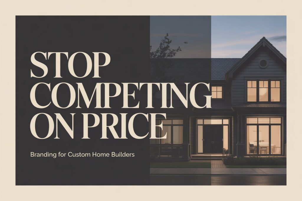
The builders who compete on price are always one cheaper competitor away from losing the job. It doesn’t matter how good the work is, how experienced the team is, or how solid the relationships are. If the only thing separating you from the next quote is a dollar figure, you’re playing a game you can’t win long-term. The builders who’ve stopped competing on price share one thing in common: they invested in branding for custom home builders before it felt urgent. Their brand does the pre-qualifying work before the first call. Prospective clients arrive having already decided they want to work with them – and price is secondary to that decision. This post covers how that positioning shift happens, what it requires, and what it looks like in practice for residential builders in Brisbane. Why Home Builders Get Stuck in Price Comparison The root cause of price competition isn’t the market – it’s the absence of visible differentiation. When a prospective client can’t tell the difference between two builders from their websites, their social media, and their proposals, they default to the only signal they can compare easily: the number at the bottom of the quote. This isn’t a reflection of the client’s values. Most people building a custom home are not primarily motivated by finding the cheapest option – they’re motivated by finding the right builder. But when every builder presents themselves the same way, with the same generic language, the same template website, and the same portfolio format, “the right builder” becomes impossible to identify. Price fills the vacuum. In our experience working with 20+ Brisbane builders, this is the single most consistent pattern: builders doing genuinely premium work, losing jobs to competitors doing inferior work, because their brand positioning doesn’t reflect the quality gap. The client couldn’t see it – so price decided. What Happens Without Brand Differentiation Without a clear brand position, every sales conversation starts from zero. You’re explaining who you are, what you do, and why you’re worth what you charge – to someone who arrived with no context and no prior conviction. That’s an expensive way to sell. With a clear brand position, the client arrives already oriented. They’ve seen the website, read the project descriptions, noticed the quality of the photography, and formed a view. The conversation is about fit and logistics, not about justifying the price. What Premium Builder Branding Actually Does Branding is not a logo. It’s the complete system of signals your business sends before, during, and after every client interaction – visual, verbal, and experiential. For a residential builder, that system includes the website, the brand identity, the proposal format, the site signage, the email signature, and the way each of those things makes a prospective client feel about the business. Pre-Qualifying Clients Before the First Call The most valuable thing a strong builder brand does is filter. A brand positioned at the premium end of the residential market – with photography, typography, and copy that communicate quality and craft – attracts clients who are already looking for quality. It doesn’t attract clients whose primary criterion is price. That filtering happens passively, before any human interaction, every time someone lands on the website or sees a proposal. This is why branding for home builders isn’t a marketing cost – it’s a sales efficiency investment. The time saved not pursuing the wrong enquiries, not writing proposals for clients who were always going to go with the cheapest quote, and not renegotiating on margin compounds quickly. A well-executed brand system consistently produces two measurable outcomes: higher-calibre enquiries from clients who’ve already pre-selected on quality, and higher conversion rates in those conversations because the trust work has already been done. The Visual Signals That Communicate Premium Positioning language and brand strategy are invisible to the client – what they see is the visual execution. And the visual execution either reinforces the premium positioning or undermines it. Photography Style Photography is the loudest brand signal for a builder. A portfolio shot on a phone, or with inconsistent lighting and framing across projects, signals a business that doesn’t invest in presentation. A portfolio shot by a professional architectural photographer – consistent style, controlled lighting, properly framed – signals the opposite. The photography doesn’t need to be expensive. It needs to be consistent and intentional. One properly shot project page does more work than ten poorly shot ones. Typography and Colour These are the signals most builders underestimate. Font weight, letter spacing, and colour palette communicate quality tier before anyone reads a word. Heavy, compressed typography reads as trade-level. Light, considered typography with generous spacing reads as premium residential. The difference between Classik Construction’s refined wordmark and a generic bold condensed font isn’t arbitrary – it’s a deliberate signal about what calibre of work the business does. Earth tones, restrained palettes, and intentional whitespace consistently outperform cluttered or overly corporate colour schemes for premium residential positioning in Brisbane. Resvita’s brand identity uses this approach – warm, considered, and clearly positioned above the commodity end of the market. Proposal and Document Quality This is where brand positioning either holds together or falls apart. A builder can have an excellent website and then send a quote in a Word document with a logo pasted in the header. The client who was impressed by the website is now uncertain. The brand signal broke. Proposal templates, email signatures, and document layouts are part of the brand system. When they match the website in quality and consistency, the cumulative impression across every touchpoint is one of a business that takes its work seriously. Why Branding and Website Design Must Work Together A great brand deployed on a poor website is wasted. A great website with a weak brand is unconvincing. The system has to be consistent end-to-end – and that’s why the most effective positioning work treats brand and web design as a single project, not two separate ones. The visual identity defines the language: the colours, the
Web Design for Home Builders: What Actually Converts in Brisbane
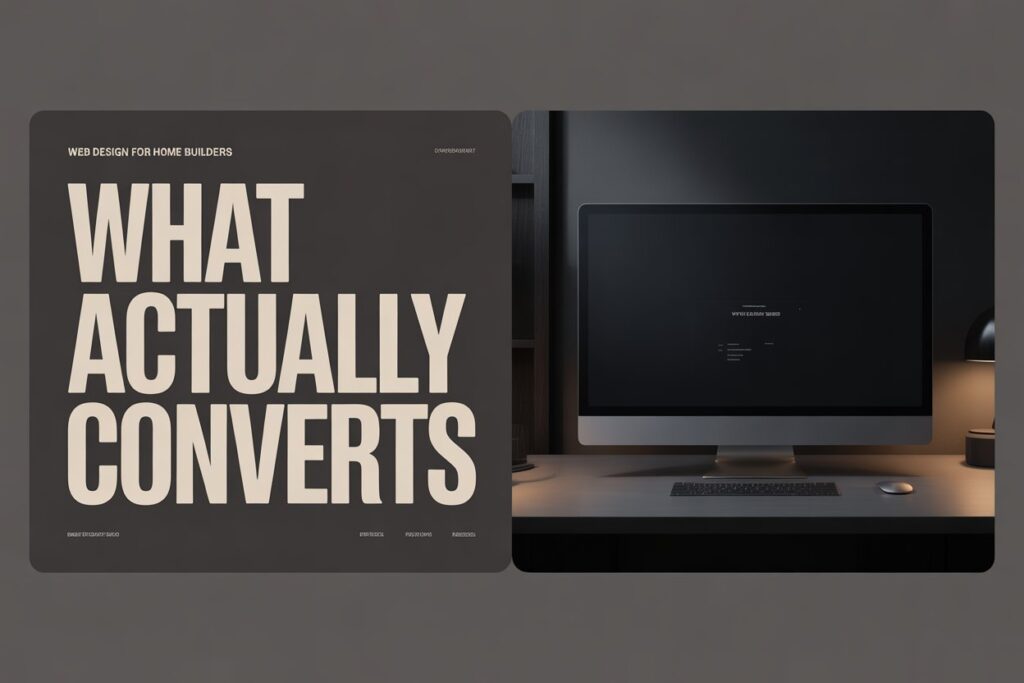
Most home builder websites look good. They have professional photography, a clean layout, a portfolio page, and a contact form. And they don’t convert. The reason is almost always the same: the site was designed to impress, not to generate enquiries. There’s a real difference between a website that makes a builder proud when they show it to a mate and a website that turns a cold visitor into a qualified lead. After working with 20+ Brisbane builders on web design for home builders, the gap between those two things is well documented. This post covers what actually drives enquiries from premium residential clients – not generic web design theory, but the specific elements that work for builders in Brisbane. Why Generic Web Design Doesn’t Work for Home Builders A home builder’s website has a completely different job to most business websites. You’re not selling a $50 product or a monthly software subscription. You’re asking someone to trust you with a $500,000 or $800,000 decision – often the largest financial commitment of their life. That changes everything about how the website needs to work. Trust Has to Come Before the Conversation In most industries, a website can get away with being a digital brochure. The sale happens in the meeting. For builders, the meeting only happens if the website passes a trust threshold first. Prospective clients are screening you before they ever pick up the phone – and they’re doing it by reading signals you may not even know you’re sending. A generic template, stock photography, or thin page content signals that the business hasn’t invested in its presentation. For a client considering a half-million dollar project, that signal carries weight. It raises the question: if they haven’t invested in this, what else haven’t they invested in? The builders winning premium residential work in Brisbane have websites that answer the trust question before it’s asked. Their photography is professional and project-specific. Their copy speaks directly to the type of client they want. Their social proof is named, suburb-specific, and outcome-focused. None of this happens by accident. What High-Converting Builder Websites Have in Common Across the Brisbane builder sites we’ve reviewed and built, the ones generating consistent premium enquiries share a specific set of elements – not design trends, but structural decisions. The Structural Elements That Drive Enquiries Suburb targeting is non-negotiable. A website that says “building across Brisbane and surrounds” ranks for nothing and reassures no one. High-converting builder sites name the suburbs they work in, reference those suburbs in project descriptions, and have pages or sections built specifically around the areas where they want to win work. This matters for both SEO and conversion – clients want a builder who knows their suburb. Portfolio entries have context, not just photos. A gallery of beautiful images with no captions is a missed opportunity twice over – once for SEO, once for conversion. Each portfolio entry on a high-converting site describes the project: location, brief, build type, any notable challenges or outcomes. “Custom 4-bedroom home in Ascot – architect-designed brief, 14-week build” tells Google what the page is about and tells a prospective client what you’re capable of. Social proof is specific. Generic testimonials (“great builder, highly recommend”) don’t move the needle. Named testimonials with company or suburb reference and a specific outcome do. The difference between “John was fantastic” and “Tide Constructions delivered our New Farm home on budget, on time, and with a level of finish we hadn’t seen from previous builders” is significant. Specificity is credibility. CTAs match the buyer’s stage. Most builder websites have one CTA: “Contact Us.” That’s a commitment ask at a point when most visitors aren’t ready to commit. High-converting sites have CTAs calibrated to where the visitor is – a free consultation, a portfolio review, a project feasibility chat. Lower friction at the awareness stage produces more enquiries at the decision stage. Service-specific pages exist. If you build custom homes, knockdown rebuilds, and dual occupancy – those are three different services with three different search intents and three different client profiles. One “Services” page cannot rank for all three or convert all three. Separate pages for each service are one of the highest-leverage structural changes a builder website can make. Why Your Website Isn’t Converting (Even If It Looks Good) This is the question that comes up most often in our initial conversations with Brisbane builders. The site was professionally designed, the photography is strong, the portfolio is genuinely impressive – and yet the enquiries coming through are mostly price shoppers. The Common Failure Modes No FAQ. The questions prospective clients have before calling a builder are highly predictable: How long does a build take? What’s included in the contract? How do you handle variations? Do you use subcontractors? A website that doesn’t answer these questions forces the client to call to find out – which most won’t do at the early research stage. An FAQ section keeps them on the site longer and moves them closer to a qualified enquiry. No mobile optimisation. The majority of homeowner research happens on mobile. A website that isn’t genuinely fast and easy to navigate on a phone is losing a significant percentage of its traffic before those visitors even see the portfolio. This isn’t about responsive design as a checkbox – it’s about load times, tap target sizes, and the experience of scrolling through a portfolio on a phone screen. Generic copy throughout. “We are committed to quality craftsmanship and customer satisfaction” appears, in some variation, on approximately half of all builder websites. It signals nothing, differentiates nothing, and converts nothing. Copy that speaks to a specific client situation – “we work with clients who’ve already been let down by a builder once and aren’t taking that risk again” – converts because it resonates. No named author or face. People hire builders, not businesses. A website with no photo of the principal, no name in the copy, and no personal story is harder to