First Impressions Matter: What Home Builders’ Websites Communicate Before Anyone Reads a Word

When a prospective client lands on your website, they make a decision in roughly three seconds. Not a decision about whether to contact you - a decision about what calibre of builder you are. That judgement happens before they read a single word of your copy. It's entirely visual, entirely instinctive, and entirely within your control.
Most home builder websites we see have the same problem: they were built to showcase completed projects, not to communicate brand positioning. The photography is solid, the layout is functional - but nothing signals whether this business builds $250K homes or $800K homes. Everything looks the same. And when everything looks the same, prospective clients fall back on the only differentiator they can easily compare: price.
In our experience working with 20+ Brisbane builders, the gap between builders who attract premium enquiries and builders who spend all their time on price-comparison calls almost always comes back to the same thing - what their website communicates in the first few seconds of a visit.
What a Builder's Website Says in the First 3 Seconds
Before anyone reads your headline, before they check your suburb coverage, before they look at your portfolio - they've already formed an impression. That impression comes from a handful of visual cues that fire instantly.
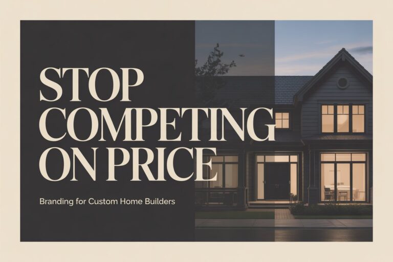
Photography quality is the loudest signal. A single hero image shot on a phone, slightly underexposed, says one thing. A full-width image of a completed Kenmore build - sharp, architecturally framed, properly lit - says something entirely different. The difference isn't necessarily budget; it's intent. Builders who invest in quality photography are signalling that they care about the end product. Prospective clients read that signal immediately.
Colour palette and whitespace communicate price point. This is less obvious but equally powerful. Cluttered layouts with lots of competing colours read as budget-tier. Clean layouts with a restrained palette, generous whitespace, and intentional typography read as premium. This isn't arbitrary - it mirrors how luxury brands across every industry signal their positioning. Think about the difference between a discount retailer's website and a high-end furniture brand's website. The same logic applies to construction.
The logo and brand mark set the tone. A pixelated logo, an outdated wordmark, or a font chosen because it "looks like buildings" immediately signals that the brand hasn't been invested in. Clients don't consciously notice this, but they feel it. When Classik Construction updated their visual identity, client feedback mentioned words like "professional" and "established" - not because anything in the copy changed, but because the visual system now matched the calibre of their work.
If your website is sending the wrong signal in those first three seconds, everything else you've written is fighting uphill.
The Difference Between "We Build Houses" and "We Build Premium Homes"
There's a version of builder website copy that reads like a brochure from 2009: "We are a family-owned building company with over 15 years experience delivering quality homes across Brisbane." It's not wrong. It just doesn't do anything.
The builders winning premium residential work in Brisbane are communicating something different. They're not listing credentials - they're describing outcomes. They're not saying "quality homes" - they're saying who those homes are for and what the experience of building with them looks like.
Positioning language is the difference between being selected and being quoted. When a prospective client reads copy that matches their aspirations - "custom homes for clients who want their brief followed, not interpreted" - they feel understood. When they read generic copy, they start comparing you to every other builder using the same template.
The same principle applies to every word on the page. "Family-owned" is generic. "Three generations of Brisbane builders" is specific. "Quality construction" is generic. "Homes built to QBCC standards with a 7-year structural warranty" is verifiable. Specificity builds trust. Generic claims erode it.
There's a reason the luxury brand creation process at Breakpoint Studios starts with positioning before it touches design. The visual system has to express something. If you haven't defined what your business stands for - what calibre of work you do, what type of client you want, what makes you different from the builder two suburbs over - then no amount of good design will fix the problem.
Why Your Competitors' Websites Are Winning Enquiries You Should Be Getting
This is an uncomfortable truth: some of your competitors are winning work not because they're better builders, but because their website makes them look like better builders.
The web design for home builders space in Brisbane has a clear divide. There are builders with well-designed, conversion-optimised websites that signal premium positioning - and there are builders with outdated or generic websites that leave prospective clients uncertain. Uncertainty defaults to price comparison. Certainty about quality allows for premium pricing conversations.
What are the well-positioned builder websites doing differently? A few consistent patterns from the 20+ Brisbane builder brands we've reviewed:
- Named testimonials with specific outcomes. Not "Great builder - highly recommend." But: "Tide Constructions delivered our New Farm home on time and on budget. The attention to detail on the joinery alone was worth every conversation." - [Client name], New Farm. Named, suburb-specific, outcome-focused social proof.
- Portfolio pages with context. Not just photos, but project descriptions: location, build type, brief, challenges overcome. Each portfolio entry is an SEO opportunity and a trust signal simultaneously.
- A clear service hierarchy. The website makes it easy to understand what you build, where you build it, and who you build it for. Visitors aren't left guessing whether you do knockdown rebuilds, new builds, or extensions.
- Conversion-oriented CTAs. Not just "Contact Us." Something that matches the buyer's stage - a free consult, a portfolio review, a site inspection offer.
These aren't expensive changes. They're intentional ones. And they compound - each element reinforces the others, building an overall impression that says: this business takes its work seriously.
What Tide Constructions Changed - and What Happened
When Tide Constructions came to Breakpoint Studios, they were getting enquiries - but not the right enquiries. Most calls were price-driven. Prospective clients were treating them as one of several quotes to collect rather than a preferred builder to engage.
The issue wasn't their work quality. It was how their brand was representing that quality. Their website and visual identity weren't signalling the calibre of homes they were building.
Working through the residential builder package, we rebuilt the visual identity from positioning upward - defining who Tide builds for before touching a single design file. The outcome was a brand system and website that pre-qualified prospective clients before the first call. Enquiry quality shifted. The full case study details the process and outcomes once published - but the core lesson applies to any builder in the same position: when your brand matches your work, the right clients find you.
Does Your Website Pass the 5-Second Test?
Here's a simple self-assessment. Pull up your website on your phone (not your desktop - most of your prospective clients are on mobile). Set a timer for five seconds. When it goes off, stop and ask yourself:
- Is it immediately clear what you build and where? Or does someone have to read several paragraphs to understand your niche?
- Does the visual quality match the quality of your work? Would a client who sees your portfolio expect this website, or something better?
- Is there a clear next step? Can someone immediately see what to do if they're interested - or are they left hunting for a contact form?
- Does the typography and layout feel premium, mid-range, or budget? Be honest.
- Is there a face or a name? Do they know who they'd be building with - or is it all logos and project photos?
Most builder websites fail at least two of these. If yours is failing three or more, the website isn't presenting your business fairly. You're likely losing work to competitors who are no better at building than you are - they're just better at presenting.
Summary: The Builder Website First Impression Checklist
A quick reference for auditing your own site's first impression:
- Hero image quality: Professional photography, well-lit, architecturally framed
- Colour and whitespace: Clean, restrained palette - not cluttered or template-heavy
- Logo and brand mark: Crisp, intentional, positioned correctly in the header
- Headline: Builder-specific, speaks to outcomes, not credentials
- Subheadline or intro copy: Describes who you build for and where, not just what you do
- Social proof visible above the fold: At least one named testimonial or client reference
- Clear primary CTA: One action you want visitors to take - visible without scrolling
- Mobile performance: Loads fast, layout works, CTA is tappable
If more than three of these aren't working on your website right now, your first impression is costing you enquiries.
Frequently Asked Questions
How important is a builder's website to winning residential work?
A home builder's website is the single most important pre-qualification tool in the business development process. In the Brisbane residential market, the majority of prospective clients conduct online research before reaching out to any builder - and in many cases, they've already formed a preference before making contact. According to HIA's residential construction research, the decision to contact a builder is heavily influenced by digital presentation, particularly photography quality, professionalism of the brand, and the clarity of the value proposition.
For builders targeting premium residential projects, the website serves a specific function: it either confirms or contradicts the client's assumption about the calibre of work on offer. A website that looks generic or outdated signals a business that hasn't invested in its presentation - and clients making $500K+ decisions are acutely sensitive to those signals. A well-structured builder website with strong photography, clear positioning, and named social proof consistently produces higher-quality enquiries and reduces the volume of price-comparison calls. The website doesn't close the deal; it earns the first conversation.
What should a home builder's website include to make a strong first impression?
A home builder's website makes a strong first impression through five core elements working together: professional photography that accurately represents the quality and scale of work completed; a visual identity (logo, colour palette, typography) that is clean and intentional rather than generic; copy that speaks directly to the prospective client's situation and outcome - not a list of the builder's credentials; named social proof, ideally suburb-specific testimonials from real clients with specific outcomes; and a clear primary call-to-action that matches where the prospective client is in their decision process.
The most common failure mode in builder websites is strong photography undermined by poor visual identity - or strong branding undermined by generic, credentialing copy. The entire system has to work together. A prospective client experiencing a well-designed builder website, with strong photography, clear positioning, and credible social proof, should arrive at the conversation already confident in the builder's calibre. That confidence shortens the sales cycle and reduces price sensitivity considerably.
How do I know if my builder website needs a redesign?
The most reliable signal is the quality of your inbound enquiries, not the volume. If most of the people contacting you are primarily asking about price, or comparing you directly to cheaper competitors, your website isn't pre-qualifying prospects effectively. Other indicators include: an outdated visual identity that no longer matches the calibre of work you're doing; photography that was taken more than three years ago and doesn't represent your current portfolio; a website that wasn't built specifically for your niche and location; or a mobile experience that is slow, cluttered, or hard to navigate.
A useful benchmark: show your website to someone who doesn't know your business and ask them what calibre of builder they think you are after five seconds. If their answer surprises you - either because it's too low, or because they couldn't answer - the website isn't representing you accurately. A redesign doesn't have to be a complete rebuild; sometimes targeted improvements to photography, copy, and visual identity are enough to shift the impression meaningfully. The important thing is to approach it as a positioning exercise, not just a design update.
Conclusion
Your website is doing one of two things: pre-qualifying the right clients before they contact you, or sending the wrong signal and leaving you to compete on price.
The good news is that first impressions are entirely fixable. The photography, the layout, the copy, the brand identity - these are all variables you can change. Most builder websites we see aren't failing because the builder doesn't do great work; they're failing because the website hasn't been built to communicate that work clearly.
If you're not sure what impression your website is making, the honest test is to look at it the way a prospective client would - on your phone, cold, for five seconds - and ask whether what they'd see reflects the calibre of what you build.
Not sure what impression your website is making? Book a free brand preview →
About Devlin Hampson
Devlin Hampson is the founder of Breakpoint Studios, a Brisbane digital design agency specialising in web design and branding for residential home builders. He works with builders across Queensland to help them attract premium clients and reduce low-margin enquiries. With experience across 20+ builder brands, Devlin focuses on the intersection of brand credibility and conversion - building digital systems that attract higher-budget projects and pre-qualify enquiries before the first call.
Connect on LinkedIn: https://www.linkedin.com/in/devlinhampson/
You May Like